5 Reasons to Redesign Your Website: Benefits and Examples

Anyone who does business online knows how important a beautiful and functional website design is. You can spend incredible budgets on advertising, company image building, and many other ways to draw attention to your business, but what’s the point if the user doesn’t get any further than the landing page? Users want an eye-pleasing picture and an intuitive interface, and in their absence, won’t leave business any second chances. Users will simply go to a competitor who has it all.
The problem is, you can’t just create one perfect design and call it a day. The web design industry is constantly changing, adopting new standards and rules, following fashion trends, and just finding what works well. Large companies update their website design regularly, and small businesses also have to do it if they want to stay afloat. But how do you know if your website needs a redesign? In this article, we’ll look at 5 reasons to redesign your website and tell you how it can be done in the best possible way.
1. Rebranding
Of all the reasons for redesigning a website, this one is the most obvious. Your business may have new services, your vision and concept may change, or you may start to expand and target new markets. Whatever the reason is, you still need to update your online resource from time to time so that it doesn’t look like the company is stuck in the early 2000s and hasn’t offered anything groundbreaking since. Companies that want to stay afloat are constantly evolving and updating, and with them, should evolve their logos, as well as the appearance and usability of their online resources.
Example: Siemens
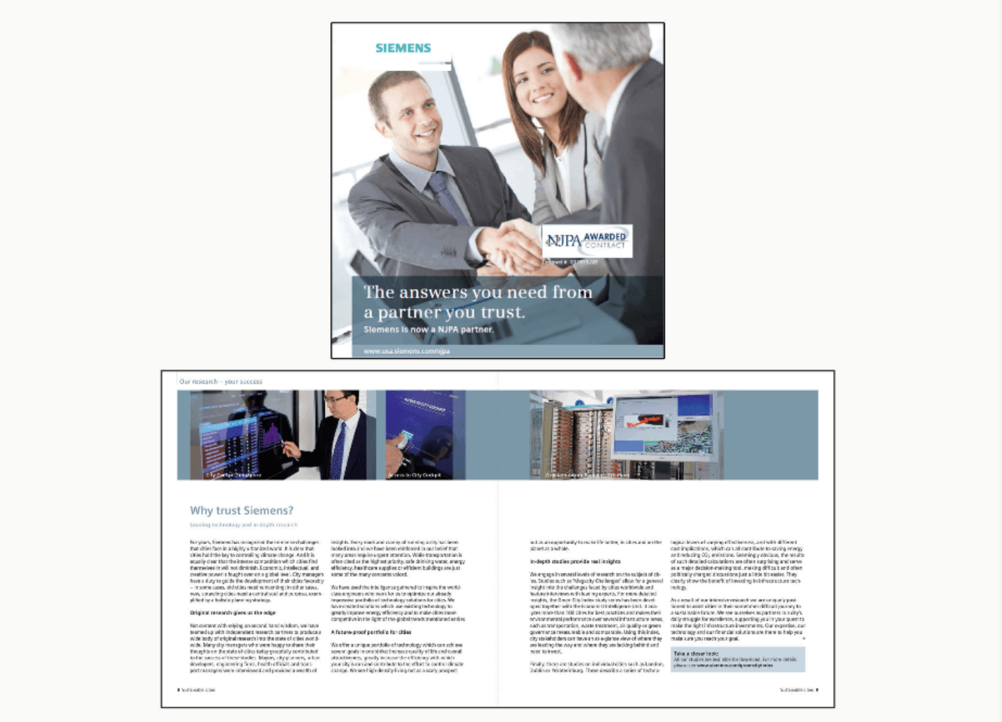
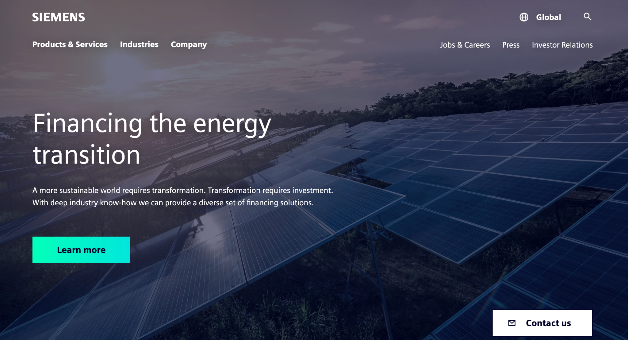
Siemens is a company with almost 200 years of history. Such businesses are extremely reluctant to change. However, even at Siemens, executives realize that a modern company’s website will not entice potential customers with pictures of men in jackets shaking hands and cumbersome texts. Now Siemens has its own rebranded bright visual style, easy navigation, and a strong emphasis on people rather than business. This allows even such an old and B2B-oriented company to stay relevant in the 2020s.
2. Low page load speed
Users can forgive your site’s outdated appearance, strange usability decisions, and many more design flaws. What users will definitely not forgive you for is low page load speed. At best, the potential lead will think the page did not open. In the worst case, they may think that you aren’t very much concerned about the image and state of your business, and therefore, it’s better to leave now.
This is especially true for firms that use their web resource for direct sales. Human desire to spend money is usually impulsive, and if the impulse for their goal ends before the page opens, then a potential customer can simply go satisfy it on a neighboring tab. Moreover, high page load time is terrible for the position of the site in search engines’ rankings.
High page load times can indicate that your site is overloaded with functionality or uses outdated technologies that require a lot of computing resources. In both cases, you need to optimize and redesign your site to meet user expectations and search engines’ guidelines.
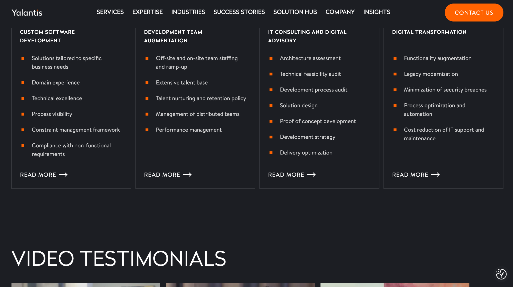
Example: Yalantis
Yalantis, a software development company, is a prime example of improving things by increasing download speeds. By taking all the necessary steps to ensure that the website is SEO friendly and meets the requirements of Google page speed insights and metrics provided by the Livepage team, Yalantis managed to achieve an increase of 70,000+ visitors.
3. Low traffic
You can change the appearance of your site as much as you want, but what’s the point if users don’t see it? The way out of this situation can be not just changing the visual part but planning full optimization, adding new sections, and filling the resource with interesting content.
For example, you can add a new section to your site with a blog. This will attract users, make them stay longer on your site, and will have an extremely positive impact on search engine rankings. According to a study, sites with a blog have a 434% greater chance of being ranked highly on search engines.
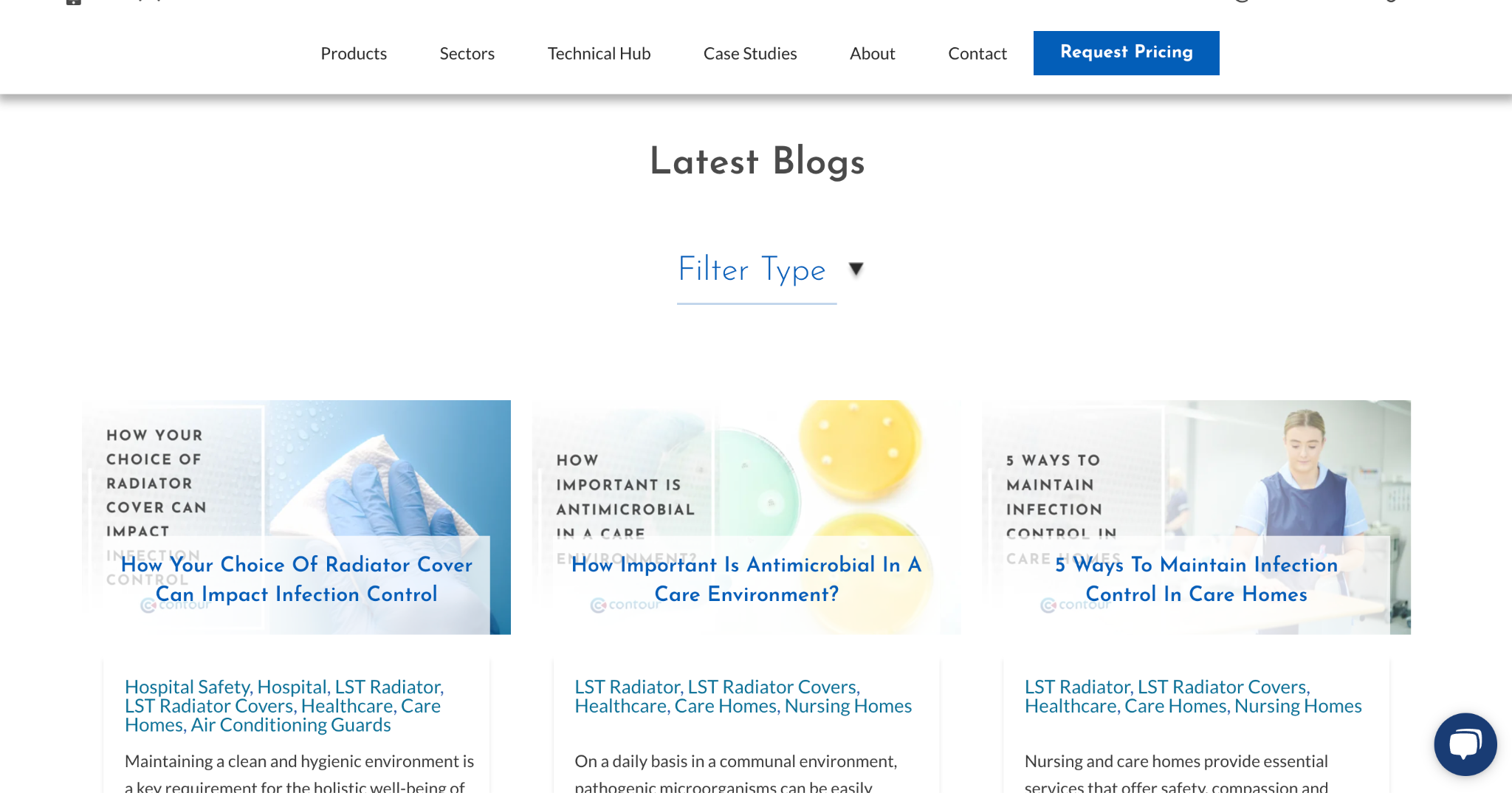
Example: CONTOUR HEATING PRODUCTS LIMITED
This site was suffering a lot from a lack of organic traffic. After studying the possible solutions to this challenge, Livepage specialists came to the conclusion that the most effective way to increase the number of users along with website redesign would be to emphasize content marketing. As a result, the company achieved a 2,000% increase in organic traffic, a 1,200% increase in transactions, and over £2,000,000 in revenue.
4. New functionality
Another reason to redesign your website is new functionality. Your site may provide some handy tools like a cost calculator, or it may be a full-fledged SEO platform. In both cases, you can’t just insert a new feature into an old design and pretend it’s always been there. As a rule, adding new functionality always involves a new look and changing the layout of elements. This can be avoided only if you have recently updated the site with the scalability and those new features in mind.
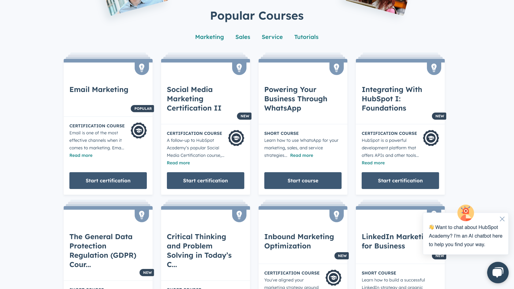
Example: HubSpot
A good example of redesigning a project to add new features is HubSpot Academy. This educational resource was full of interesting content, but navigating the site and finding the right article turned into a headache. Understanding that elements of the website need a redesign, experts took into account the needs of users and added a convenient search and content filter. This significantly improved usability and brought the user experience to a new level.
5. Lack of mobile version
The total dominance of smartphones as a means of accessing the Internet is obvious, and if your website is not user-friendly for mobile devices, you may only wonder at which stage of the sales funnel a potential customer will be snapped up. Unfortunately, many business owners don’t realize or simply don’t know that websites need to be adapted for mobile devices. Thus, the need for a good mobile version of the site is a good reason for redesigning your website entirely.
Example: Art Institute of Chicago
A good example of how a mobile version of a site can give a resource a significant boost. If before users had to be satisfied with an awkward interface, after the redesign, all the elements are where you expect them to be.

Conclusion
Now you know every major reason to redesign a website. One way or another, you’ll have to redesign your web resource at some time to meet the new trends and standards. In this case, you should ask yourself not why to redesign a website but how exactly to do it. If you need to redesign a website, you want your site to attract new customers and retain old ones. Therefore, you need to find real professionals who know exactly what they are doing and why. That’s where the Livepage team excels!
By contacting Livepage, you’ll get exactly what you expect and even more. You’ll have at your service 50+ certified professionals in SEO, technical, and other aspects of promoting your website. We deep dive into the process and develop the perfect optimization and promotion strategy for your business. Bring the site to the first page of search engines’ rankings, as well as attract hundreds and thousands of new users.
Every year, our clients entrust us with over $1,000,000 advertising budget, and it is enough to look at our case studies to understand why. Here’s just one example of how our specialists managed to develop the website structure and promotion strategy from scratch, reaching 10,000 users and over 100 conversions a month.
Contact us now, and together, we will ensure that your website is future-proof and the flow of new leads is constant. Don’t hesitate, as it’s high time to consider a website redesign!


