
3 Reasons Why Email Design Is Important for a Successful Campaign

“You don’t get a second chance to make a first impression,” Coco Chanel once said when email marketing was not yet a thing. But if it was, she would probably agree that the principle applies to emails, too.
Today, with our inboxes constantly flooded with marketing emails, we don’t have the time or energy to read them all. It is likely only the ones with an eye-catching subject line will be opened at all. Thus, it takes a top-notch email marketer to get a user to interact with an email promotion.
So, let’s talk about the importance of email design and why great email design matters.
How email design contributes to success
Email design plays a pivotal role in the success of your marketing campaign. Here’s why having great email design is so important to enhance user experience and engagement:
First impression
The first few seconds after a user opens your email are crucial. If your email design is clear and eye-catching, the recipient is more likely to keep reading. Nice colors, high-quality images, and well-matched fonts can make a positive first impression. Implementing better design principles in small details like well-positioned buttons, centered headings, and structured text will significantly improve the overall impression.
Professional look and feel
Why is email design so important? First of all, the way your message looks directly affects readers’ perceptions of your brand. Having clear and thought-out visual effects is a sure way to build trust with your audience. Also, if your email design remains consistent and reflects your brand style, it can help you with market positioning and building a loyal customer base.
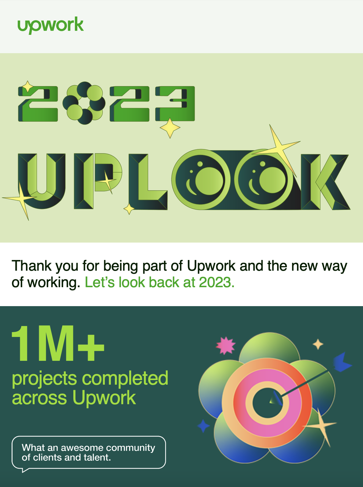
Example of professional design:

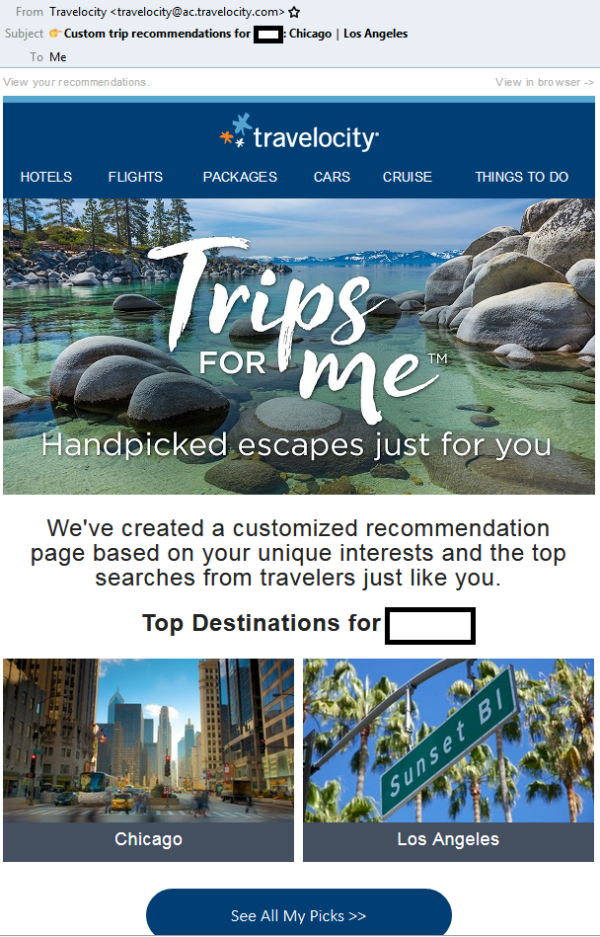
Example of poor design:

Ease of perception
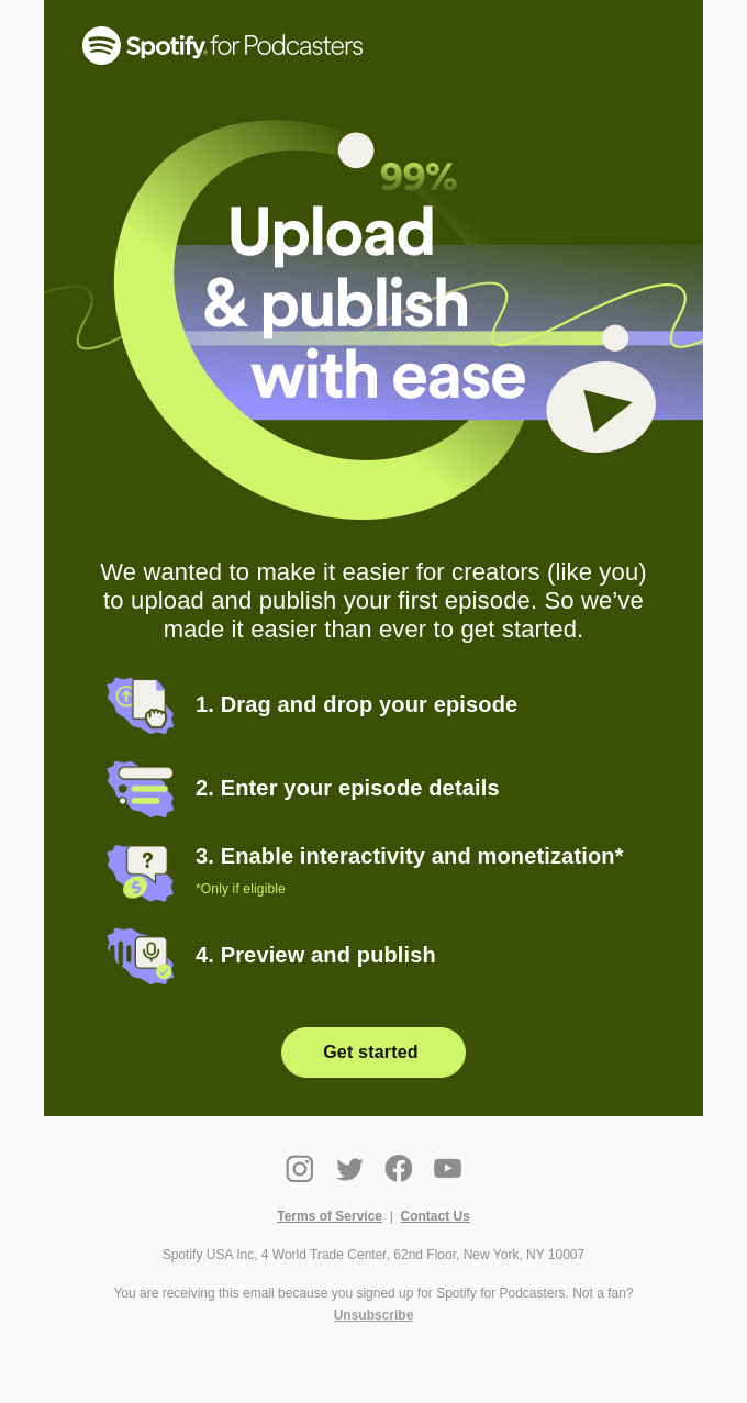
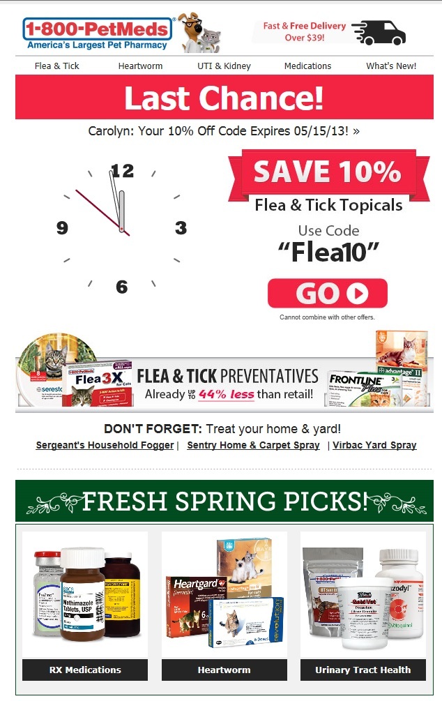
A well-designed email presents information in an accessible and easy to understand manner. For instance, headings, images, buttons, and text with clear positioning can all emphasize the key points of your message. An email with informative visuals is far better at conveying information than a simple text.
Example of successful email design:
Example of a poor email structure:
Additional factors impacting email effectiveness
Beyond basic email design best practices, several key factors can significantly boost the effectiveness of your campaigns. These elements ensure your messages not only reach a wide audience but also engage and convert them effectively. Here’s a breakdown of what makes a good email design:
1. Responsive design
In 2022, 46% of all emails were opened on mobile devices. After seeing an email on their phone, 50% of users completed the purchase through the mobile version of a website. Given the widespread use of mobile devices, an effective email design should be responsive. That is, it should look good on a screen of any size. Mobile-friendly emails typically provide better UX (user experience) and enjoy a higher conversion level.

2. Call to action (CTA)
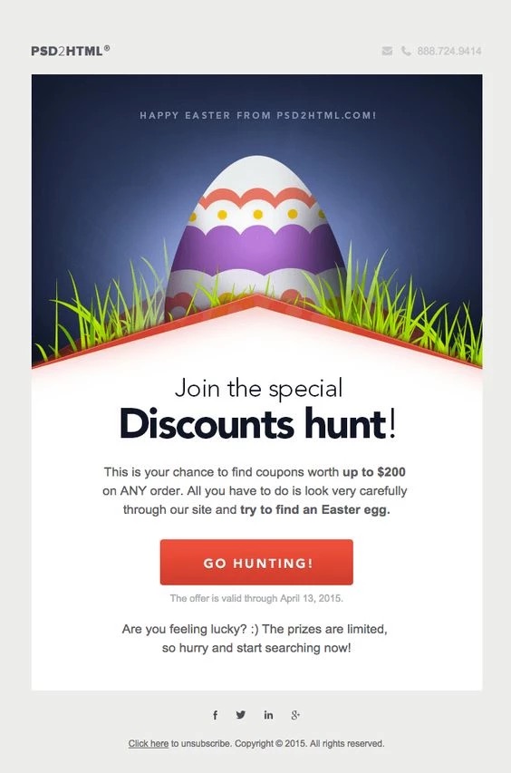
A call to action — a button or link that motivates the reader to perform a certain action — plays an important role in good email design. The CTA should be eye-catching, but having a proper message is just as essential as the color choice. A clear and appealing CTA encourages recipients to make a purchase, register, or visit a landing page.
3. Personalization
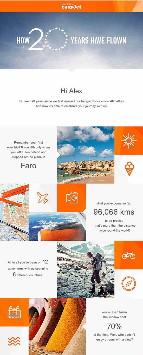
According to Campaign Monitor, personalized emails achieve an exceptional OR (open rate) of 29% and CTR (click-through rate) of 41%. Personalization includes not only using personal data, such as addressing the user by name, but also relevant content selected based on the client’s preferences. Taking into account the nature of your audience when creating email design matters a lot, as it will make your content far more engaging.
4. Accessibility
A good email design should be accessible. There are many ways to improve accessibility: alternative image text, readable fonts, and appropriate colors will all make it easier for people with certain impairments to read your emails comfortably.
Creating your design: tips and tricks
As we’ve already mentioned, when crafting your email design, it’s vital to consider both aesthetic appeal and functionality. Here are some practical tips and tricks to guide you in creating attention-grabbing and efficient emails:
Color and visual content
The choice of color palette can significantly impact the effectiveness of your advertisement, with the potential to enhance or completely ruin the message you’re trying to convey.
- Avoid excessive color. An abundance of bright, incompatible colors can spoil email layout and make it difficult to read.
- Highlight with bright colors. Use bright colors to emphasize key points of the message. Balance them out with neutral and calm colors in the header and footer.
Optimal email width
The 600px email width is considered to be optimal for several reasons.
- It helps avoid horizontal scrolling. This is essential for creating a user-friendly interface with no need to scroll left and right.
- Most services handle the 600px width well, ensuring the email is displayed correctly. This includes popular email services such as Gmail, Outlook, Yahoo, etc.
- It is a good format for mobile optimization. This width allows for a responsive design that can be displayed correctly on the screens of various mobile devices.
Text-to-image ratio
The optimal image-to-text ratio in emails is 60-40 or 70-30. That is, 70% text and 30% images. This helps to maintain a balance in email’s visual content and makes it look more refined.
A/B testing
Don’t neglect testing. Even the best designs may fail if they don’t resonate with your audience. Experiment and always look for new combinations of subject lines, colors, and CTAs.
Wrapping up
So, is email marketing design important? The way your messages look goes a long way to create a positive user experience and drive user engagement. That’s why email designs are a significant part of any marketing campaigns. Visual elements can also help you better convey your message, connect with your audience, and achieve your marketing goals, as proven by our numerous successful cases!
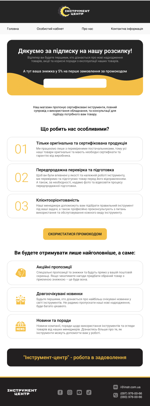
If you still use email templates from your ESP system in your email marketing, it’s about time you leave this DIY practice behind and trust our team to create a unique and engaging email design for you. Just look at one of the email examples we’ve created for our client:

Contact us now and rest assured your email design is in good hands!


