How to Make Your HVAC Website Design Successful: 5 Best Tips

When homeowners or business owners need heating or cooling services, where do they go first? That’s right, Google. While online presence has long become a must-have for local service providers, simply having a website is not enough. If it is outdated, hard to navigate, or poorly designed, visitors will click away and turn to your competitor instead. What you need is a professional, well-optimized website, since it:
- Builds trust at first glance.
- Makes it easy for customers to find and contact you.
- Positions you as a credible expert in your field.
- Improves your visibility in search engine results.
- Drives leads while you sleep.
In a word, a well-structured HVAC website isn’t just nice to have; it’s an essential marketing asset that will boost your revenue, reputation, and reach. In this guide, we’ll explain how to build an HVAC website that performs and provide valuable HVAC web design tips to make your website a solid digital foundation for your business.
Table of Contents:
- Thought-out Visual Design
- Convertible Content
- Excellent User Experience
- Make use of mobile-specific functionality
- Conversion Triggers
- Examples of Awesome HVAC Websites
1. Thought-out Visual Design
When someone visits your HVAC website for the first time, you only have a few seconds to make a lasting impression. That’s why HVAC website development starts with a strong visual design. Yet, it’s not just about looking good and capturing attention; it’s about communicating credibility, professionalism, and trustworthiness.
Which color should you use?
Color plays a subtle but powerful role in how people perceive your brand. For HVAC businesses, it’s smart to choose a color scheme that reflects reliability, cleanliness, and energy efficiency. With no strict rules on a specific color palette, here are a few actionable recommendations:
- There are various color schemes to choose from: blues are calming and suggest trust and expertise; greens often represent energy, efficiency, and eco-friendliness; oranges and reds add warmth appropriate for heating-related visuals. Combining complementary colors will create a website that is pleasing to the eye.
- Stick with 2–3 main colors and use them consistently for buttons, headings, and backgrounds to maintain a cohesive, professional look.
- Try to stay clear of black or dark colors and those that might be too toxic, such as neon green. Create color combos in a way that makes the website look attractive and not overwhelming, while keeping the text readable.
- Use bright colors only for elements that you want to stand out, such as Request services, Contact forms, etc.
If you are unsure what color to use, consult professionals who can offer the right palette and help you create an awesome web design for HVAC services online.
Make a clear first screen
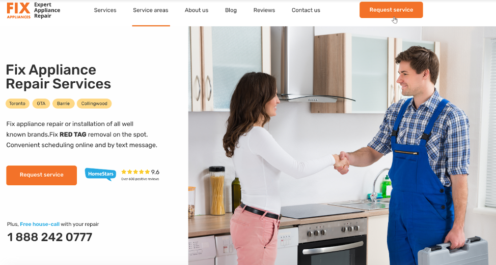
The “first screen” or “above the fold” area is what visitors see before they scroll. It should be simple, clear, and catchy. There is a five-second rule in marketing: A user should understand who you are, what you do, and how you can help within 5 seconds. That is why you should place the main message on the first screen, and it should include:
- A strong, benefit-driven headline.
- A short subheading or tagline that highlights your unique value.
- A visible call-to-action like “Request a Quote” or “Schedule a Service”.
- A clean, uncluttered layout with your main brand color for buttons.
The phone number should be well visible on different devices and clickable on mobiles so that customers can simply click on it and make a call.
It’s advisable, but not necessary, to add an icon from Yelp, HomeAdvisor, or another review site to the first screen. This will immediately increase user confidence in your site, especially if you have a lot of positive reviews.
Use your own photos
Refrain from using stock photos as they look generic and feel impersonal. Instead, use your own as they are more likely to create an emotional reaction from potential clients, adding a human touch and building trust. Real photos boost authenticity and can dramatically increase conversions.
- Show your technicians on the job.
- Feature images of your office or storefront.
- Include team portraits to highlight professionalism and approachability.
Additionally, some users prefer visual content and videos over text. So, adding a custom video to your website can also increase customer value.
Vendor and brand logos
Add logos of popular brands that you repair or partner with to strengthen your website’s credibility and help users quickly spot the needed HVAC brand and contact your company for services.
Add a row of vendor and manufacturer logos near your homepage header, in the footer, or under your service descriptions to tell visitors:
- You work with reputable, well-known brands.
- You’re a legitimate, professional HVAC provider.
- You have the proper training or authorization to install and service quality equipment.
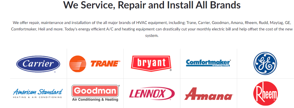
Place a block like this on your homepage and service pages.
2. Convertible Content
Great visuals may grab attention, but it’s your content that convinces people to take action. While describing what you do, a successful HVAC website persuades, differentiates, and connects emotionally. Every word and layout choice should move the visitor one step closer to picking up the phone or filling out your contact form.
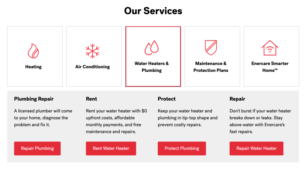
Your services block
It is one of the most important areas on your website. Visitors come with a specific need, and they want to know right away whether you can help. So, it is great to make a page that describes all the services you advertise and offer. They should be placed on the main page and other locations where consumers look for more information.
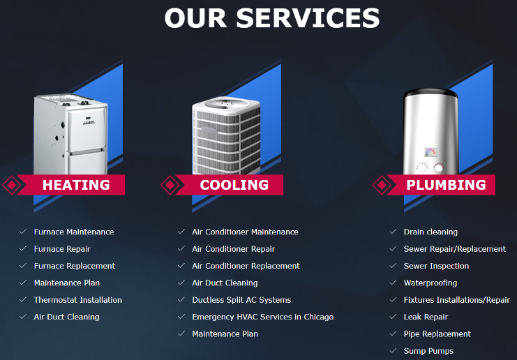
- Make this section clear and easy to scan, with icons or photos.
- Split Services section into categories: Heating, Cooling, Maintenance, Emergency Services, etc.
- Include short but specific descriptions for each service.
- Add internal links for each service to its own dedicated page for better SEO and user experience.
Here is an example of a great Services block:
Show what you do better than others
Most HVAC companies offer the same core services, so the key is to highlight what sets you apart. This not only makes you stand out but establishes your company as a force to be reckoned with. While this may be difficult, it helps to remember that you are doing something right, which makes you unique. Ask yourself:
- Do you offer faster response times?
- Are your technicians NATE-certified?
- Are you doing better in commercial HVAC?
- Is your extended expertise an advantage?
- Do you use eco-friendly equipment?
- Do you offer flat-rate pricing with no surprises?
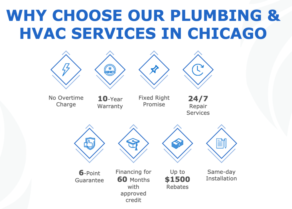
Use a dedicated section titled something like “Why Choose Us” or “What Makes Us Different”, and keep the points short, punchy, and benefit-driven.
Benefits block
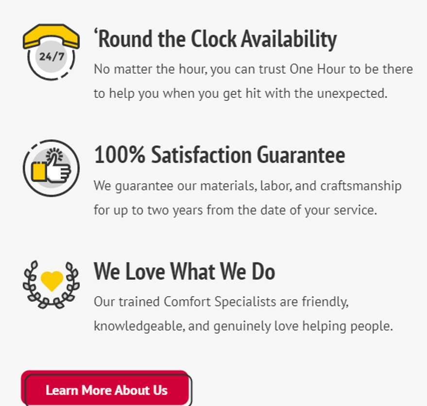
Making your company stand out from the competition is important. Hence, don’t stop at listing services; spell out the benefits of working with your team. People want to know what’s in it for them.
Benefits can attract more customers and noticeably boost lead generation. Dedicating a separate page for benefits allows you to add all the perks of hiring your services. Always keep it short and simple, and think customer first. Instead of saying “We install HVAC systems”, state “Save on your energy bill with a new, high-efficiency HVAC system installed by experts.”
This block can be implemented in different ways. Here are some examples:

Add awards
If you’ve won local business awards, been rated highly on review platforms, or carry certifications from industry leaders, showcase them proudly. Awards tell that your HVAC company is qualified and trustworthy, and make customers take you seriously.
Awards also increase awareness and third-party validation, and they show that you are a leading authority in the heating and cooling business. To add credibility to your website and services, place badges, logos, or small award images throughout your site, especially near CTAs or testimonials.

Touch customers’ emotions
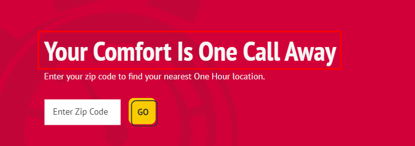
People don’t just hire based on facts; they often decide based on feelings. A great HVAC website speaks to your customers’ emotions and values. This is not an easy task as it requires a deep knowledge of what matters most for your target audience when they visit your website.
Try weaving in messages that touch on:
- Comfort – “Keep your family cozy year-round.”
- Safety – “Don’t let a broken furnace put your home at risk.”
- Reliability – “When it matters most, we’re here to help.”
Here is a great example of such a message:
3. Excellent User Experience
A beautiful HVAC website packed with compelling content might fail to perform as expected if users can’t find what they’re looking for quickly and easily. Meanwhile, when your website is simple to navigate, loads smoothly on all devices, and guides visitors naturally toward action, you’re already halfway to earning their business.
Easy-to-follow navigation
Do you have a lot of information to share or provide a wide range of services? Make sure you don’t place all the components on one page, as it can look messy. Create a natural visual hierarchy that guides customers. A well-structured web design for HVAC companies should embrace the following level options:
- Homepage: It should include your logo, straightforward navigation, a headline, text content, a call-to-action, contact details, and a footer.
- Services: When a client visits your website, you want them to easily understand the services you provide, such as heating/AC Installation, repair, or maintenance.
- Service Areas: You can list suburbs if you work in one city or cities where you provide HVAC services. This way, you can provide specific contact details according to a suburb or city.
- About Us: This page tells customers a little bit about your business, including when it was founded. Adding your values helps you build an emotional relationship with customers.
- Contacts: Making it easy for people to contact you is the main goal of a good HVAC website. Your phone number has to be prominent. You can place it in the top right corner of your website. Placing contact forms and CTAs across your website will also prove effective.
- Reviews: Place positive reviews on your website to showcase the work you have done. Reviews show that you are a trusted HVAC contractor.
- Blog: A blog is a useful way of engaging customers. It allows you to provide additional information about heating and cooling devices.
- Other pages are optional: Additional pages that you might add include cases or customer support.
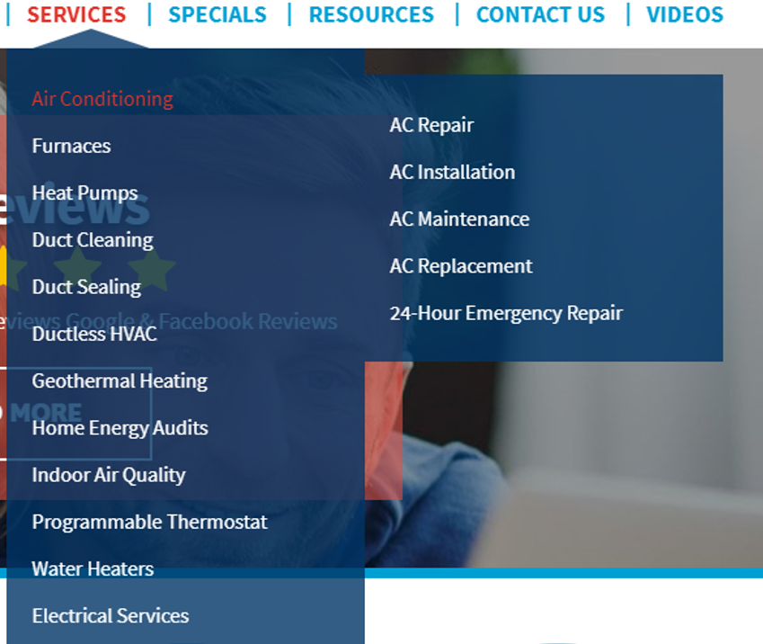
It is essential to make the top menu simple and provide smooth navigation from one page to another. Streamline the most important pages into subcategories with dropdown menus to avoid overcrowding. Keep your wording simple and familiar, while avoiding jargon or clever labels that make people guess what’s behind them.
Don’t forget about mobile design
52% of online searches are made from mobile devices. With more than half of your website traffic likely coming from smartphones and tablets, if your site isn’t mobile-friendly, you’re losing potential customers. A clunky mobile experience feels outdated and tells visitors you may not be modern or reliable in your services either.
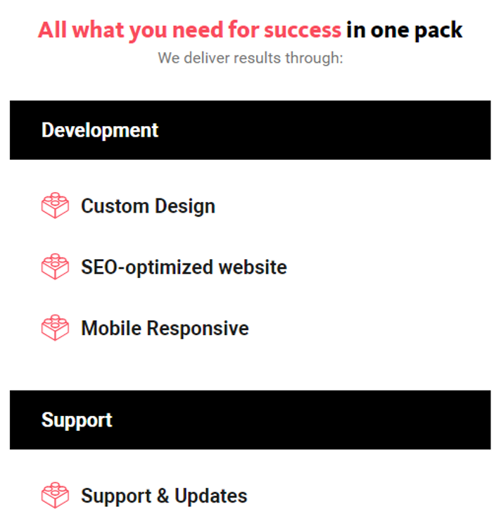
Reduce the amount of content
All mobile phones have different screen sizes. Due to the smaller screens, what looked appropriate on computers can turn into endlessly scrolling through pieces of text on smartphones. Thus, if possible, reduce the number of texts displayed on smartphones.
Here is an example of a block with headlines and text on the desktop:
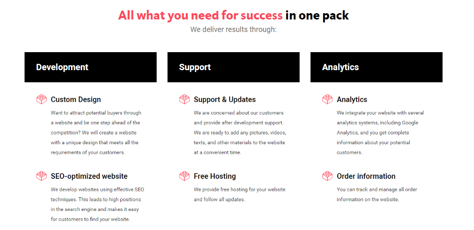
But for the phones, we left just headlines without text to facilitate reading for customers:
Get rid of pop-ups on the phones
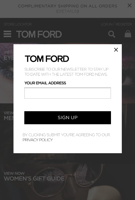
Almost еverybody hates pop-ups, especially on their phones. Our advice — don’t use them. But if you still want to create a pop-up (e.g., with a coupon), here are some recommendations:
- Don’t cover all page content with a pop-up.
- Don’t show a pop-up for visitors in the first 30 seconds.
- A pop-up should be easy enough to close.
- Don’t show a pop-up for your permanent clients.
Streamline request forms
It is extremely inconvenient to type a lot of text on smartphones, so minimize the amount of information that should be entered.
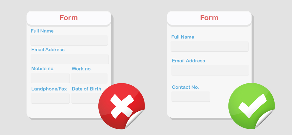
Usually, there are three fields for input on HVAC websites: phone, name, and email. It’s enough to contact a client and find out their needs by phone.
Important! When a customer fills out the information in one field and presses Enter (or OK), they should be automatically transferred to the next field.
Keep your user in a single browser window
Be sure that links on your website open in the same window where a customer is located. There are two arguments against opening links in new windows:
- Opening a link in a new window can disorient a potential customer.
- Users can find new tabs or windows inconvenient.
Make use of mobile-specific functionality
The difference between the main sites and mobile sites adds opportunities. For example, you can make all of your phone numbers click-to-call and turn your address into a link for navigation.
4. Optimization for Local SEO
With a great website in place, you also need people in your service area to find it. This is where local SEO comes into play to help your website appear in geo-specific and related “near me” searches. Along with visibility, you also need to build trust so that potential customers feel confident choosing you over the competition. Here are a few smart strategies for how to boost both your local search rankings and credibility.
Create service area pages
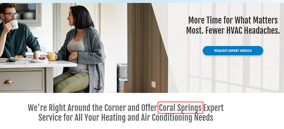
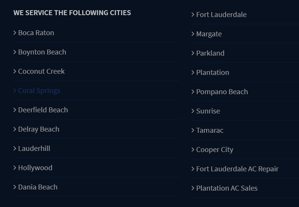
Google favors websites that clearly show where they operate, and so do customers. HVAC service website location pages make it easy for customers to find you. That’s why you should always have a service area page in place. Even if you only work in one city, include other surrounding areas as well.
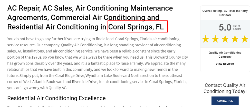
Each individual service area page should include:
- The specific city or neighborhood name in the title, content, and meta description.
- Services available in that area.
- Local landmarks or neighborhoods to show you’re familiar with the region.
- A call-to-action, like “Book service in (City) today!”.
Let’s take a look at the example of Miami. If you work only in this city, then the pages of locations will be Miami areas (counties) — e.g., Coral Gables, Miami Gardens, North Miami, etc. If you serve the surrounding cities (areas), then create city pages: Aventura, Dania Beach, Fort Lauderdale, etc.
Examples of such pages:
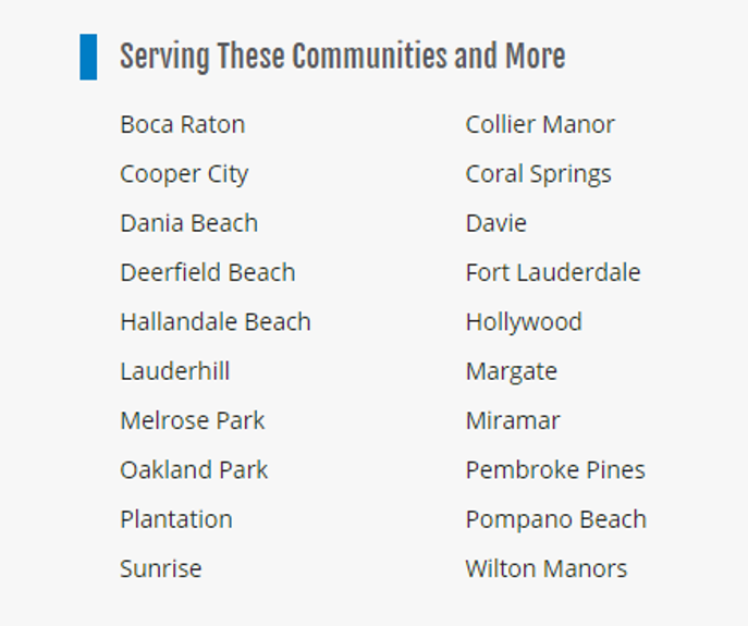
This strategy helps Google understand your geographic reach and connects you with people in nearby towns who are ready to hire.
ZIP code search
If you work in the USA, then you should implement a ZIP code search. This tool is a user-friendly way to show exactly where you work. Instead of guessing, visitors can quickly check if their location is covered, which creates a smoother experience.

- When users enter their ZIP codes, they should automatically get an application form.
- If you serve this city, the ZIP code can also lead to a service page of the city. This all depends on how you build your marketing funnel.
- If you do not serve a city, then a message should appear stating that the requested location cannot be processed.
Prove your expertise with reviews
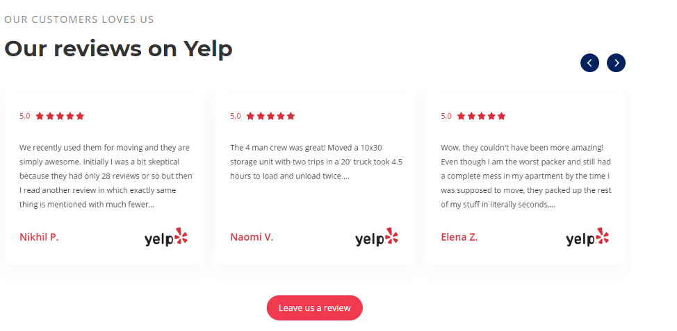
70% of customers check reviews when considering businesses and confirm that reviews often impact their buying decisions. So, nothing builds trust faster than real customer reviews. To make the most out of this opportunity:
- Feature top-rated testimonials on your homepage and service pages.
- Include a photo of the reviewer (whenever possible) for authenticity.
- Highlight reviews that mention specific services (“Fast furnace repair!” or “Great pricing on AC installation”).
The reviews on your website should be taken from many reliable sources and social media, such as Facebook, Google, Yelp, and HomeAdvisor. Make sure you never use fake reviews to avoid punishments from search engines that use artificial intelligence to rank your site. With Livepage Software, your reviews can be added to the website automatically from different sources.
Analyze competitors for additional ideas
If you want to know what’s working in your market, check out the niche competitors among the top HVAC SEO, HVAC marketing, and HVAC website design ideas on the first page of Google search results.
You can find additional features such as calculators, questionnaires, and other solutions or extras that may be useful for your business. Make sure you analyze your competitors’ backlinks and metadata for potential new keywords to get more traffic. Likewise, you can spot opportunities they’ve missed or areas where you can do better.
5. Conversion Triggers
Once a visitor lands on your HVAC site, your goal is to guide them to take action, be it scheduling a service, requesting a quote, or calling your team directly. Thus, our HVAC website design tips wouldn’t be complete without mentioning conversion triggers. When done right, these elements create a seamless experience that helps potential customers to move from browsing to booking without pushing.
Make call-to-action (CTA) buttons
Your buttons are the most important clicks on your site, guiding users toward booking or contacting you. To make them work:
- Be clear and direct. Use action-focused text like “Get a free consultation”, “Start a free trial today”, “Book a service now”.
- Place CTAs strategically. Include them in the top right corner of every page, after key service descriptions, in your homepage hero section, or at the end of testimonials or reviews.
- Use strong visual contrast. Your buttons should stand out from the rest of the page (bold colors, larger font, clean design).


Don’t overwhelm users with too many CTAs, though. Focus on one primary action per page and repeat it thoughtfully.
If you want to learn more about creating a great CTA block, you should read this article.
Schedule an HVAC service form
An effective scheduling form to book or request service online should:
- Be easy to access via a pop-up, a sticky button, or a dedicated booking page.
- Ask only essential questions like name, ZIP code or address, type of service needed, preferred date and time, and contact method.
- Offer reassurance, such as “We’ll call to confirm your appointment”.
Avoid adding too many fields since customers are mostly reluctant to fill them all out and might simply walk away.
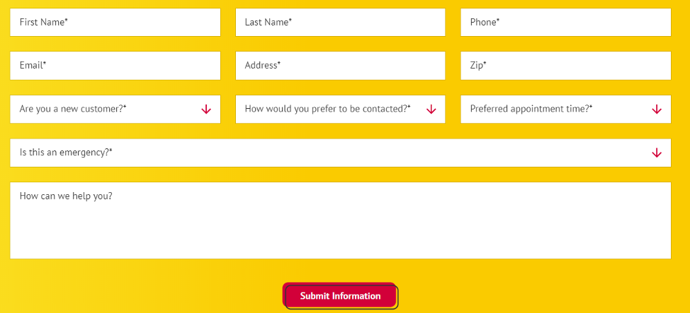
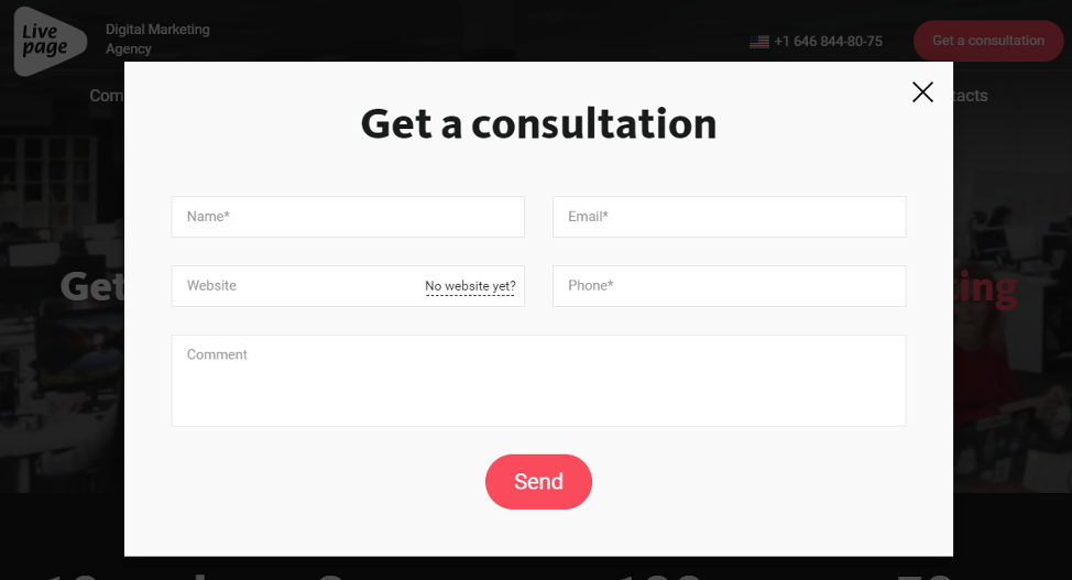
Pay special attention to mobile devices. It’s hard to fill in many fields from them. A good solution will be to make different forms for smartphones and computers.
For example, here is a contact form on the desktop version of Livepage’s website. It has five fields:
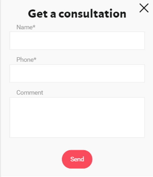
But on smartphones, it changes to the three most necessary fields:
Forms can be placed on your homepage and other subpages. Put forms next to the content that visitors will be reading, as this will attract their attention.
Examples of Awesome HVAC Websites
Sometimes the best way to understand what works is by looking at examples of companies that might have used website design services for small businesses and are already doing it well. Let’s consider three well-set HVAC websites, each having amazing features.
One Hour Heating & Air Conditioning
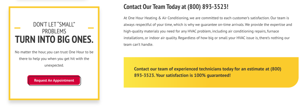
One Hour Heating & Air Conditioning is a great example of how to build a high-performing HVAC website for a national brand with local branches. It is easy to use and mobile-friendly, and it has simple text and a helpful blog for customers to read. The site uses a simple combination of three colors: red, white, and yellow. Bold CTA buttons are prominent, consistent, and persuasive.
GrandComfort
GrandComfort keeps things simple, modern, and user-first, proving that you don’t need a flashy design to make a strong impression. It combines smooth navigation, color contrast that is easy on the eye, and a mobile-friendly, visually pleasing web design. Customers see all services provided, areas served, and benefits. GrandComfort shows a perfect example of what a contact form should be like — short and precise.
Enercare
Enercare pairs sleek, branded visuals with warm colors for a professional yet approachable feel and showcases great navigation. Visitors know where to look for services, can easily find their service area, and have access to blogs. Enercare also makes it easy for customers to leave reviews.
Conclusion
A website design for an HVAC company is an integral part of the marketing strategy for local appliance repair businesses or any other local business. A well-designed website is about building trust, getting found locally, and turning visitors into paying customers.
If you’re ready to boost your online presence, attract more leads, and grow your HVAC business, let the experts at Livepage help. Contact us for a free consultation.


